That Red Flower™
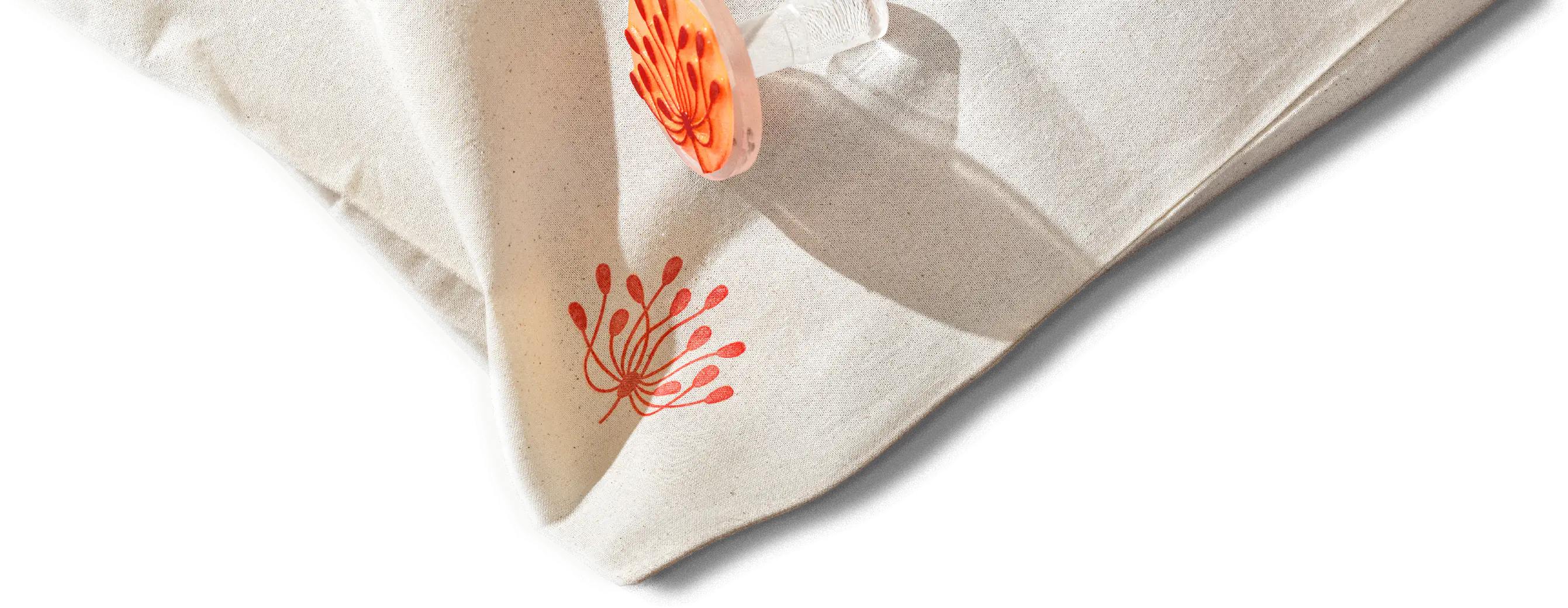
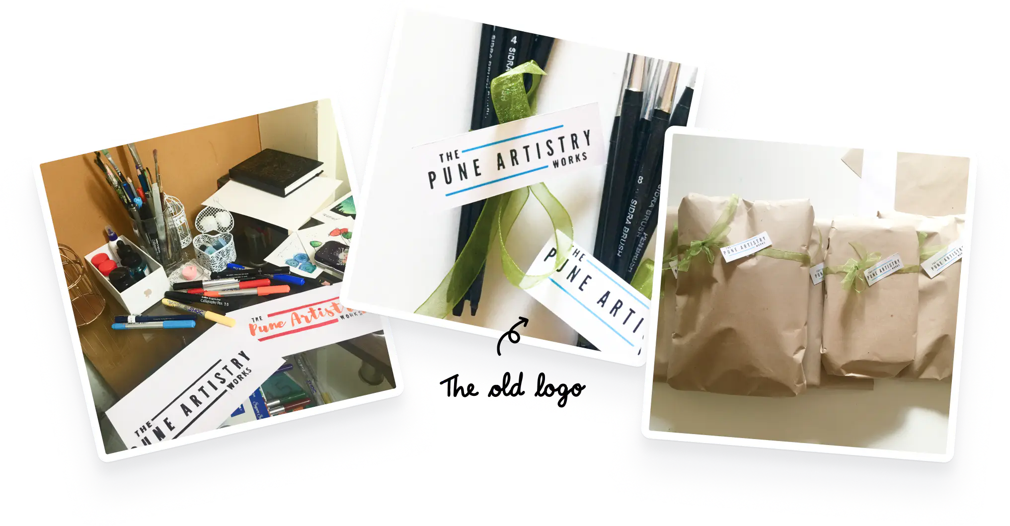
One afternoon while Aishwarya was off teaching a workshop, I took one of her old watercolour paintings and turned it into a crisp logo. Since her art uses linocut stamps to make prints, I also optimized the logo for stamping. I found a shade of red she used often with a stamp pad and that became her colour. Then I added a utilitarian logotype that wouldn’t take attention away from the art. No other restrictions on colours, typefaces and layouts.


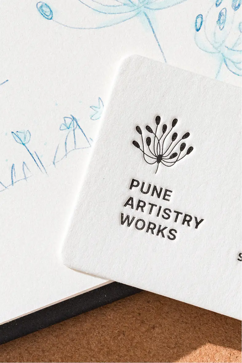


Instant rollout
The logo was designed to be easy enough to implement that Aishwarya actually started using it overnight.
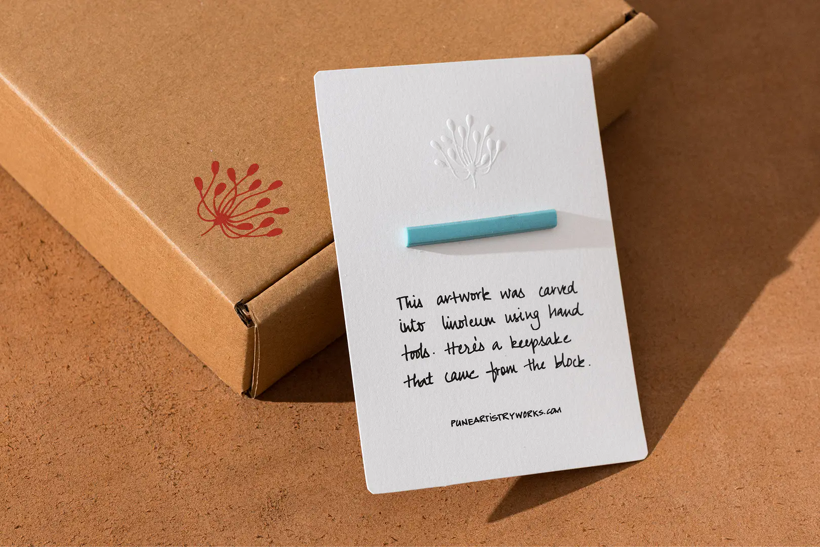
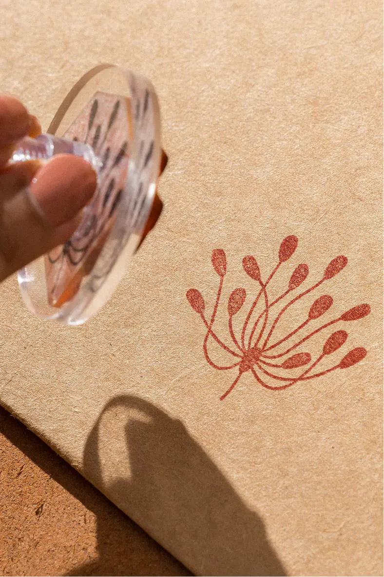
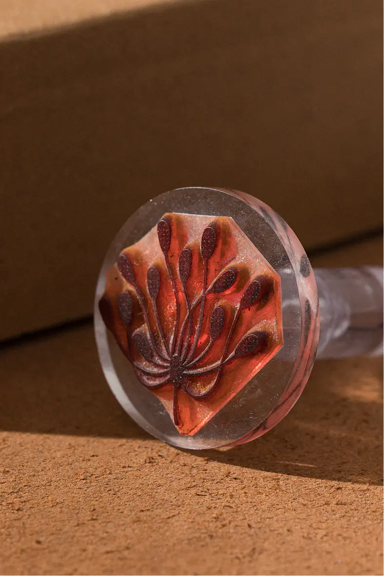
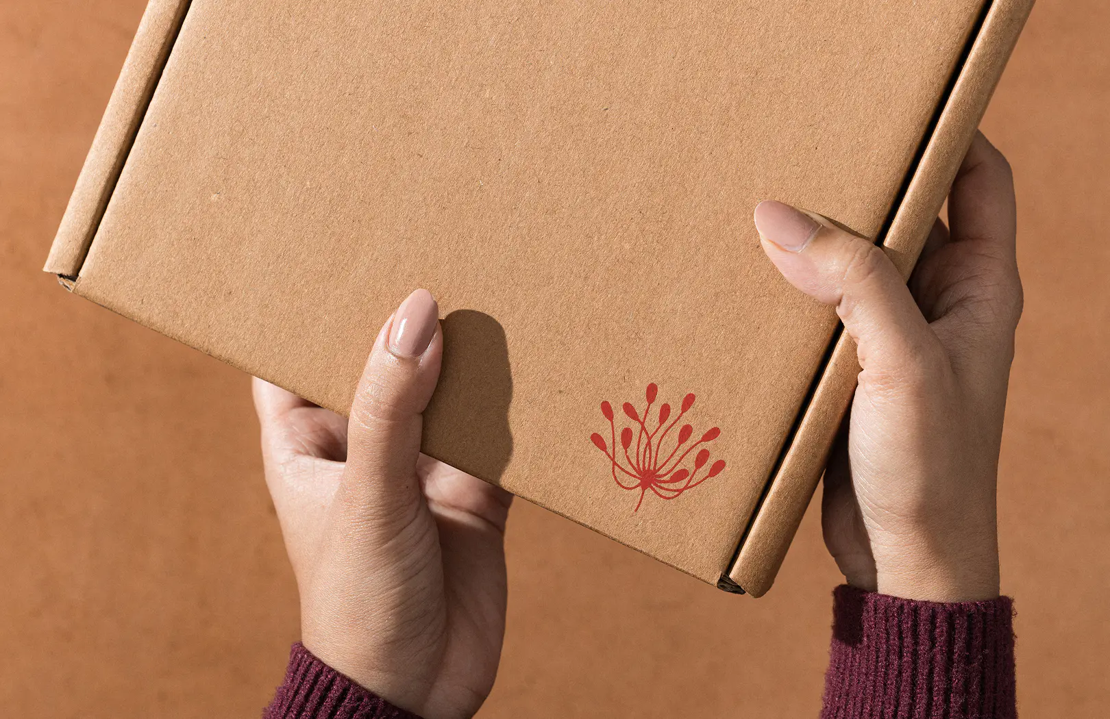
I got stickers and stamps made that she could use with her existing inks. The logo did not have a proper orientation—it could be stamped without much care and still look consistent on the corner of a document or a box. And best of all, it could be stamped on her artwork and the nice little notes she shipped with them.
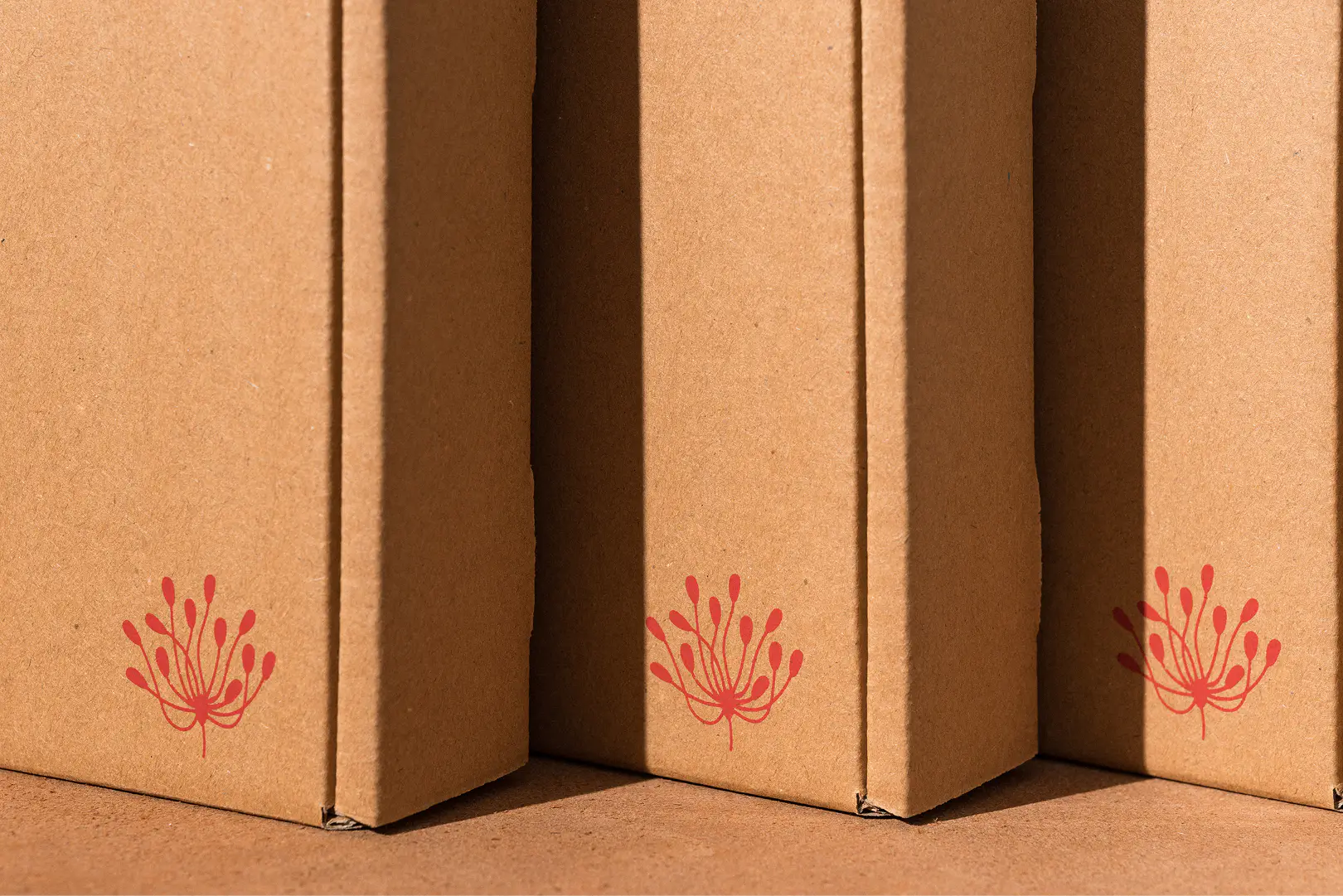
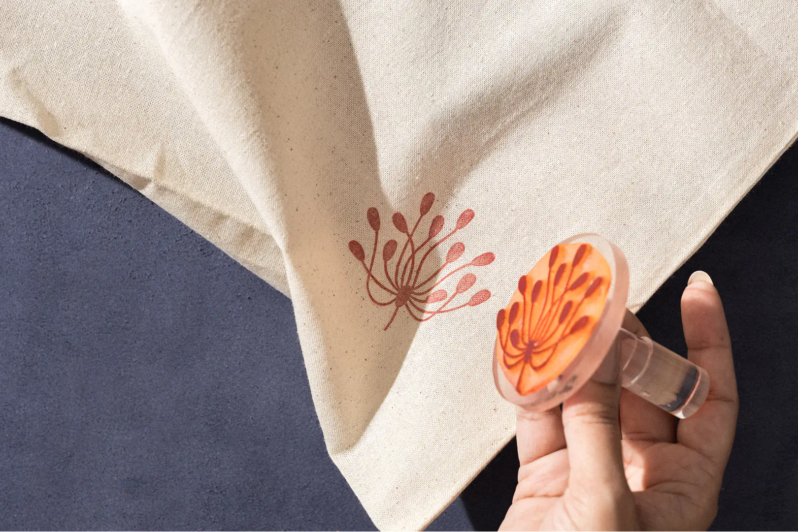
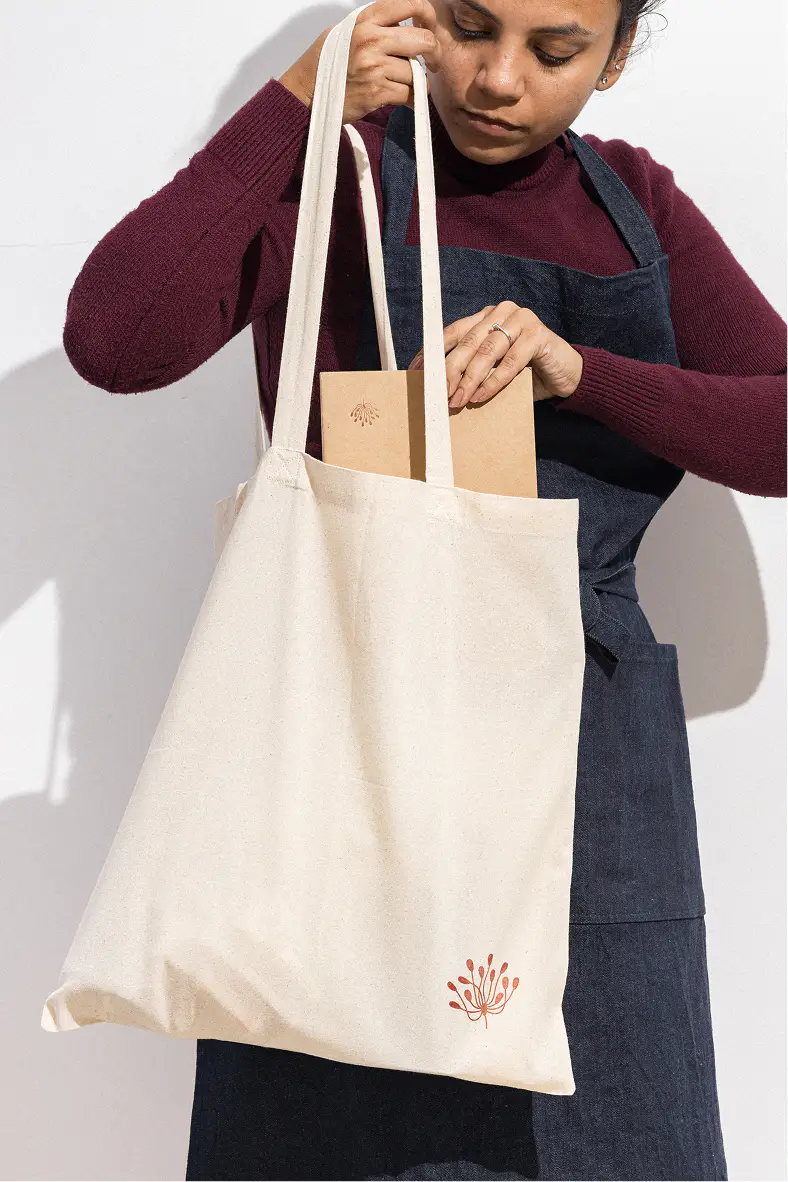
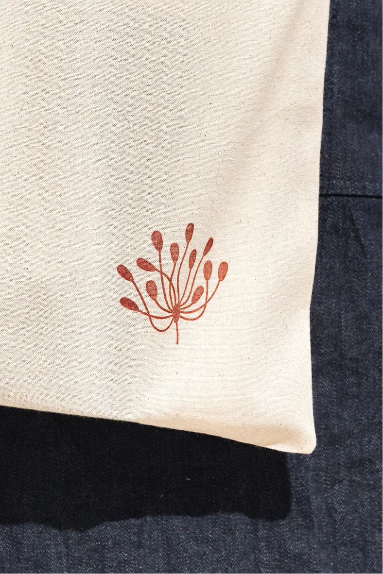
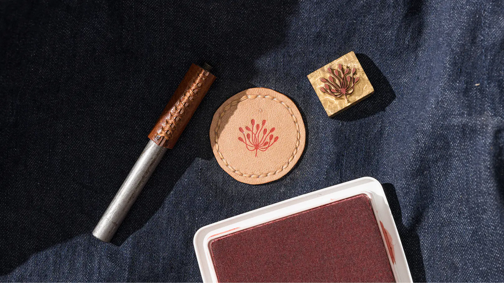
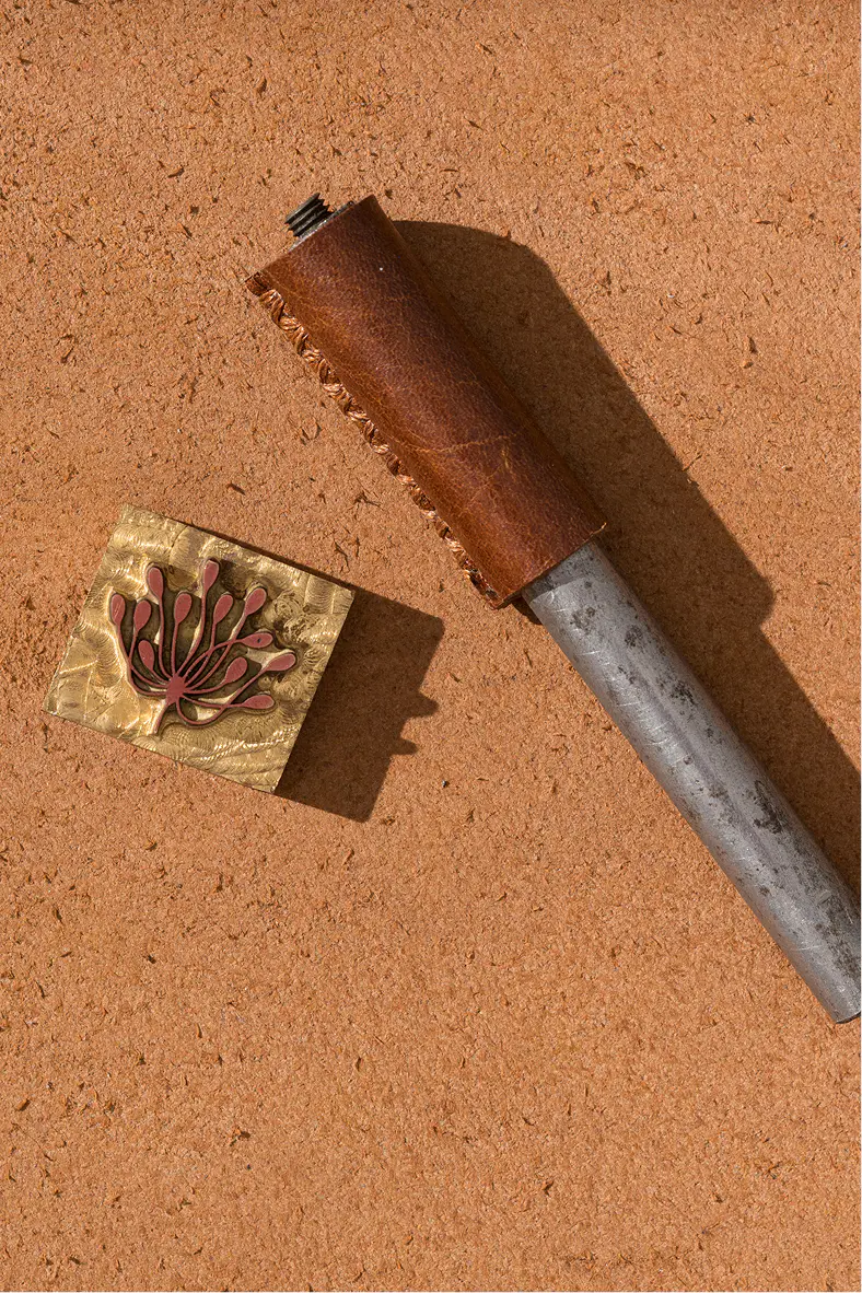
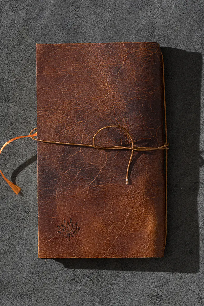
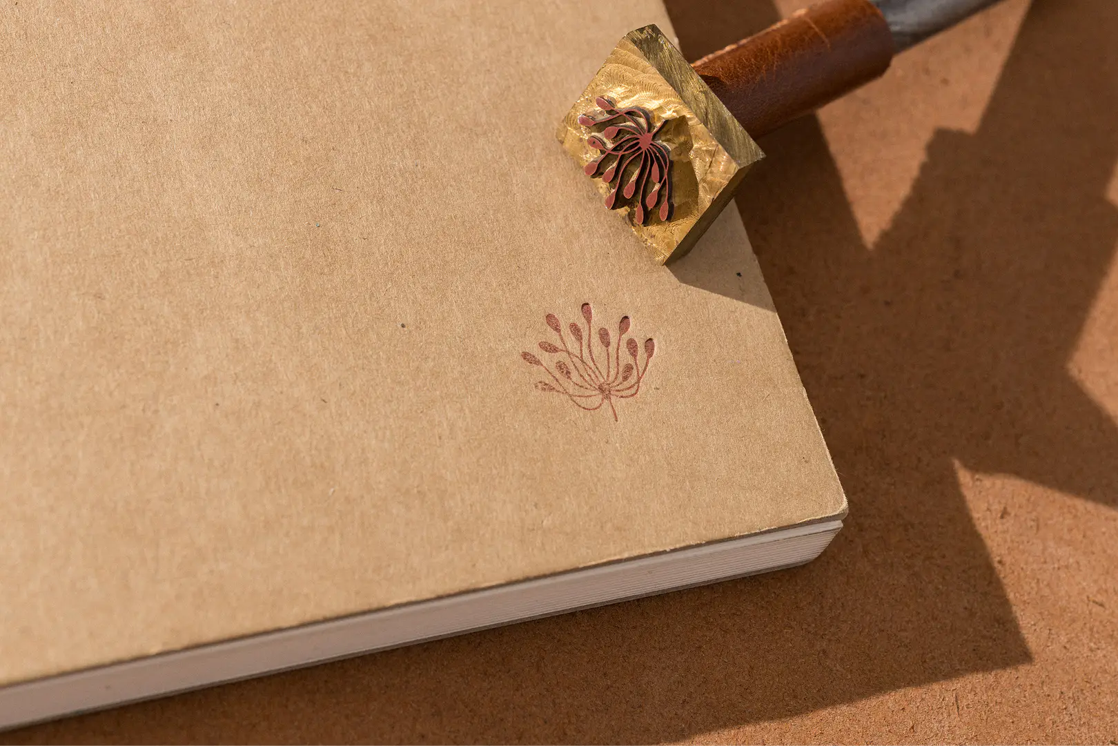
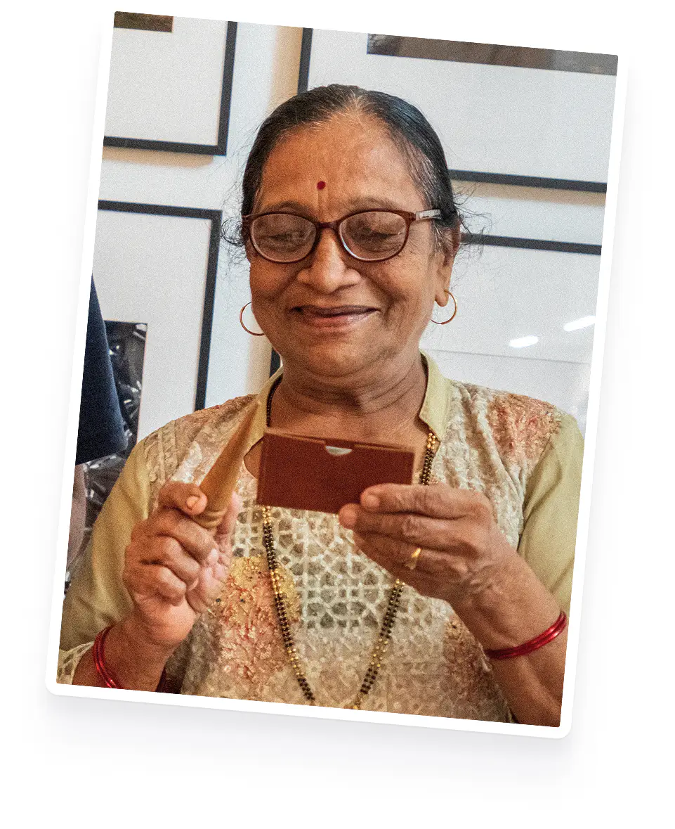
Grandmom-approved!
This quick design has been in continuously used for over five years now. Aishwarya loves it, her custoemrs love it, but the nicest validation came a little while ago.
Aishwarya's grandmom recently signed up for Instagram and called to say that she can always find her by looking for ‘that red flower’. What more could you ask for? 😊